
Once you start thinking about things from a reader’s or user’s perspective, the world can become an irritating place. Because you know how simple it can be to make things easier for people.
For example, there’s a café I go to somewhat regularly, and its door always trips me up. Think Midvale School for the Gifted, except the opposite: it’s a push door. Now, I don’t think there’s an explicit convention that doors into businesses should be pull doors, although it’s possible exterior doors are usually pull doors.
The easiest doors to open have some kind of visual cue to indicate whether to push or pull them – a visual cue apart from a verbal PUSH or PULL sign. (Those signs just aren’t very effective, because they’re often small, below eye level or far from the door handle, and the first two letters are the same in PUSH and PULL, meaning you can’t easily scan the sign. You have to read the word in full, which takes long enough that you would have to pause and think before opening the door.)
Providing a visual cue lets the door opener know in literally a split second whether to push or pull. (In usability circles, they use the term affordance for this visual cue.) A good pull door will have a handle that looks immediately like something to pull on and a good push door will have a panel that looks immediately like something to push on. A good door doesn’t need a verbal sign.
But back to this café I go to… it has a handle that invites you to pull it, but it’s a push door. And it gets me every time.
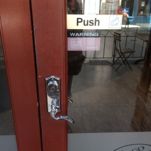
Every time, I approach, knowing that the door fools me, and every time I stand there pulling on it, feeling silly, until eventually I look down to read the sign and figure out to push it.

Leave a reply to katewilhelm Cancel reply