Of course you want to know about the work I’ve actually done. For before and after examples and for internal materials, I’m password protecting some entries. Please contact me for the passwords.
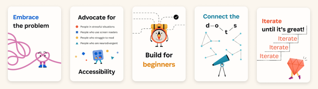
Scaling good UX decisions
I led a department-wide co-design process to create new UX principles.
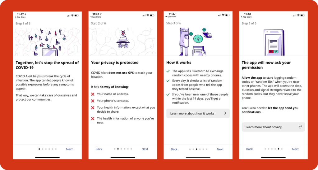
Mobile app onboarding for COVID Alert
When it launched, COVID Alert was widely lauded by experts in privacy and technology for the clarity and transparency of its content, and Apple told us it was the highest-ranked app in the world that used the Google-Apple Exposure Notifications framework. The app also won a 2021 ClearMark Award for its clear language and design. Before it retired it was downloaded by 6.6 million people and is estimated to have saved up to 100 lives.
Mobile app interface design

Shortly after the app launched, we discovered a problem: when the app was in an exposed state, it stopped checking for new exposures. We had to find a way to get people to dismiss their exposed status so it could keep checking for exposures.
Information architecture and results logic
This was an urgent project to help people navigate program eligibility criteria to find financial help for their specific situation. I designed the information architecture and results logic with mobile-first, content-first design.

Design discovery
I was the only designer on the product team that explored the feasibility of building a single point of access website with procurement opportunities from all levels of the Canadian public sector, including federal, territorial, provincial and municipal governments, as well as publicly-funded academic, social and health services institutions.
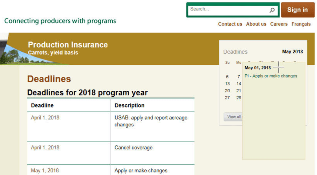
Content strategy, modelling and mapping
Overhauling agricorp.com was a year-long project I worked on from start to finish, involving a new content management system, all new content, and shifting from internal categories and mental models to a user-centred information architecture.
I did detailed and complex content mapping and modelling for hundreds of program deadlines to be shown in three different calendar formats and contexts but driven by a single source of content.
Form design – before and after
I’ve revised a lot of customer forms over the years to make them easier to understand and use. This is one example that’s fairly typical of my process.
Book and microsite design: Two-Powered
In 2009, I designed my first book (self-published), Two-Powered: A Diary of Motherhood and Apple Pie, and a microsite to make all its content available online.