
In 2009, I designed my first book (self-published), Two-Powered: A Diary of Motherhood and Apple Pie. The title is a play on the literal meaning of ambivalence, which comes from the Latin ambi meaning “both” and valence meaning strength of power. You can preview the first 12 pages of the book online (or buy it!) or visit the microsite I designed.
I designed the book to create an experience playing with that concept of two-poweredness. The images in the book are all diptychs (two photographs paired together), which I put together to create an image greater than the sum of its two photographic parts, all taken during the first two years of my first child’s life. I paired diary excerpts from the same time period with the images in a specific way to create a sort of push-pull experience, a lot like the ambivalence I experienced at the time.
Creating and sequencing the images
I first created the diptychs. I specifically did not want to make simple contrasts in the diptychs, like dark with light or soft with hard. My pairing decisions were influenced by colour, shapes, and ultimately a lyrical approach to joining the subject matter of each image in a surprising or dream-like way.
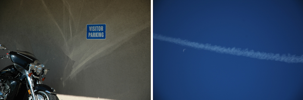
As an example, the opening image shows a motorcycle and a sign that reads “VISITOR PARKING” and is paired with an image of a jetstream and a half moon in a deep blue November sky (the sky is never bluer than in November). The sky is a very similar colour to the blue of the sign. So we’re going on a journey and it’s not entirely earthbound.
Once I created the diptychs, I spent considerable time sequencing them to take the viewer on a journey. Each diptych held some visual or conceptual relationship with the next one and in some way moved a sense of narrative forward.

The next diptych shows graffiti of a reclining woman (or maybe she’s been pushed?) on a grey concrete wall with green weeds growing in the space between the sidewalk and the wall, and a green vintage car decorated for a new bride and groom. So themes are emerging around travel, movement, nostalgia, growth within tight constraints and the suggestion that cultural institutions like marriage may be one of those constraints for women.
Selecting and sequencing the text
I selected and sequenced the text excerpts independently from the images, and constrained myself to chronological order. So ultimately the particular pairing of text and diptych was arbitrary and also a little magical. For example the text with that first diptych talks about how I always felt like my firstborn is an old soul, which has a lovely connection to the image of the sky and the moon, and that I’m obsessed with sleep, which becomes an ongoing theme in the text throughout the book. (I suspect this is an ongoing theme for most parents of babies.)
Laying out the book
Once I had all the images created and text selected, I laid out the book using InDesign. I paid careful attention to what part of the images fell into the gutter, making sure I didn’t lose important content, and how much space the text needed on each page while keeping a consistent feel from page to page. I also made typographic decisions, choosing a serif font for print.
Validation from poet Adrienne Rich
The most exciting thing for me about the book was that I got permission to include an excerpt of a poem from Adrienne Rich, which I first encountered during those first two years of my kid’s life.
“I know you are reading this poem as you pace beside the stove
warming milk, a crying child on your shoulder, a book in your hand
because life is short and you too are thirsty.”
~ Adrienne Rich, From an Atlas of a Difficult World
When I requested permission from her publisher to include it, they sent my manuscript to her for her to decide. I was terrified and giddy when I read the notification. I’d thought the publisher would make its own decision, and that it would likely reject me flat out.
While I waited, I obsessed between extremes: “My work was crap – of course she’d hate it! But she wrote a book called Of Woman Born: Motherhood as Institution and Experience – surely she’d connect with my book!” Back and forth I went until I got an envelope in the mail from the publisher. I still feel so honoured that she agreed to have her poem be part of my wee, self-published book.
Designing the website
Once I finished laying out the book, I designed a microsite so that anyone could access the content online without having to buy the book. At that time, my photography website was more of an e-commerce site connected to an on-demand printing service, and it had more of a visual personality to the look and feel than it has now. But for the Two-Powered content, I wanted a simple white background with very minimal design to keep the focus on the content. So the microsite has a completely different look and feel from the original photography website. The content aligns quite closely with the book, although it doesn’t include Adrienne Rich’s poem because my contract with her publisher didn’t include permission for that.
I designed the interactivity intentionally, and there are a few different ways to navigate through the work: clicking on the image moves you forward to the next spread, but you can also click on one of the screen numbers to go straight to a particular spread. I had experienced a lot of photography websites where you had no choice but to click image to image without skipping any, and I didn’t want to constrain my users to that experience. Above the image are also arrows to navigate through and a number showing where you are.
Now, many years later, I realize this microsite has some accessibility problems, and I’m working to get them fixed. Other than the photos, the navigation only offers very small areas to click requiring very fine motor control of users. There’s no keyboard controls. And the numbers along the bottom don’t show you where you are. While that is shown above the image, if you’re using the numbers to navigate, you don’t tend to look up. Since screens have gotten bigger, I think I will also enlarge the numbers. When I observed friends and family using the website, they typically used the numbers for navigating more than the photos.
There are definitely things I would do differently in both the book and the microsite, but that’s always the way it goes for me because I’m always learning and reflecting. They still show evidence of careful thought and an awareness of visual design principles.
