
I led a department-wide co-design process to create new UX principles.
The problem we needed to solve
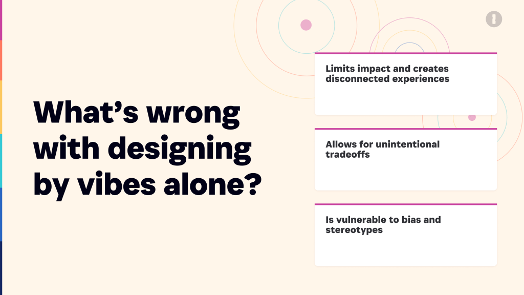
Our design values were aspirational and abstract, and they weren’t often used or referred to. The result was that different designers were prioritizing different factors when making design decisions, leading to disjointed experiences across the product. With the design org growing fast, we needed to align on what good UX decisions look like for us as an organization.
My goal was to create UX principles that:
- Are concrete and actionable – they’re written in a way so it’s clear when you’re abiding by them and when you’re not.
- Represent the best UX work currently being done – some designers will need to elevate their craft to abide by them, but they aren’t so aspirational that it becomes ok to violate them.
- Reflect our current maturity as a design org in the midst of transforming from engineering-led to product and design-led.
- Are limited to things we can take ownership of as designers and researchers.I led a department-wide co-design process to create new UX principles that:
Team structure and project details
Employer: 1Password
Stakeholders: Chief Experience Officer, Chief Product Officer, Senior Director, UX Foundations and Enablement, Managers of Product Design, Design System Manager.
Duration: 5 months to co-design new principles, get senior leadership buy-in, and create rollout plan.
My deliverables: Led co-design process to create and iterate on new principles, created and led small working group of designers representing all specialties and all user groups and platforms, planned and delivered collaborative exercise at design org offsite, briefed and guided illustrator to create visual support materials, briefed and guided content designer on final language, created rollout plan and launch presentation.
My role: UX Design Leader
My approach
I knew I wanted to create new principles through a bottom up process. In my past, I’ve seen how effective collaborative processes can be in creating buy-in for behavioural change, so that by the time you finalize the outputs, people are already halfway to adopting them.
But everyone was working flat out. So I created a small working group involving designers representing all the product areas, and I undertook a process that would maximize their influence while minimizing their time and effort. In between synchronous working sessions, I took on a lot of work to synthesize the last session and set up the next session to create meaningful contributions.
I was heavily influenced by Jared Spool’s talk on emergent design principles as rationales for future decisions. I also drew on work done by my friend and former colleague from the Canadian Digital Service, Content Designer Amy Morris.
I planned an iterative process to build on those inputs and eventually land on new principles. Once we had pretty final principles, I planned and facilitated a session with design leaders to discuss how we’d support the principles and keep them alive. From there I developed a rollout plan to launch to the design org and the wider product org. I also helped guide the development of visuals to support the principles in a way that would excite visually-oriented designers.
Workshop to practice “Playing with principles”
Before I got into the process to create new principles, I planned and delivered a department-wide workshop during a Product retreat, with the support of the working group. The purpose was to help designers and researchers understand what principles are for and to practice evaluating designs against principles. Here are a couple of slides from my preamble before the actual exercise.

Competitive analysis
There are plenty of design principles out there, but in my opinion, there aren’t a lot of great principles. And while I had principles for the principles, I wanted to share exemplars. So I combed through principles.design and found 7 sets of principles that were pretty good, and I articulated what they did well and what they did poorly.
My principles for principles:
- It’s clear when the line is crossed – helps you say no most of the time
- Useful
- Specific
- Memorable
- Practical
- Taking a point of view
- Grounded in the product
- Something we can own in design
What we make vs how we work
Early in the process, one of the working group participants shared their previous employer’s design principles. They had two sets of principles: one set for “what we make” and another for “how we work.” The designer shared that the “how we work” principles were far more useful to their work than the “what we make” principles.
I was already fixed on creating “what we make” principles, and I thought maybe the reason they found the “how we work” principles so much more useful was because the org’s “what we make” principles used abstractions. I was convinced we could create good “what we make” principles.
However, through the process, from iteration to iteration and from the working group to the design leadership group and back, “how we work” principles kept popping up. After discussion with some people outside the process, I realized that “how we work” principles could accomplish the same objective of enabling better design decisions.
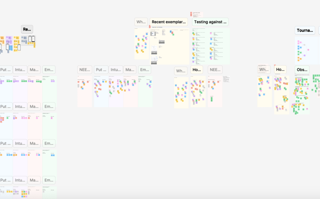
Co-design and iterations
I took on ownership of this process after each design leader had facilitated a workshop with their team to create inputs for new UX principles. The process was largely a sequence of bouncing between a generative session with the working group and then refinement with design leadership, then back to the working group to generate or further refine as necessary.
Once we had solid concepts for 4 principles, I worked with our staff content designer with fresh eyes to make the concepts into memorable slogans accompanied by clear, concrete, actionable descriptions.
First round of principles
Embrace the problem
Build for beginners
Aim for obvious
Connect the dots
Once the working group and design leadership were satisfied, I sought our feedback from several longer-tenured designers who hadn’t yet been involved.
Commitment to accessibility
I wasn’t planning to make changes to the principles themselves, but the feedback would be valuable in shaping how we roll out the new principles, and our key messaging.
But when I got the feedback, I realized we needed to revise a couple of the principles. The biggest theme was that designers were disappointed and surprised there was no mention of accessibility. We had intentionally excluded accessibility because it felt like something we couldn’t wholly own as designers and researchers, but this feedback caused me to reflect and figure out if maybe there was a part of accessibility we could own. (There was.)
Some designers also pointed out that Build for beginners and Aim for obvious overlapped a lot, so I decided to combine them.
Second round of principles
Embrace the problem
Advocate for accessibility
Build for beginners
Connect the dots
Now we were ready to share with senior leadership across the company. Again, I didn’t expect to make any changes to the principles themselves, but the Chief Product Officer wanted us to add a principle about quality, and always striving to create the best experience.
After more reflection and a couple rounds of iteration with the content designer and design leadership, and we had a new principle.
Final final final V3 of principles
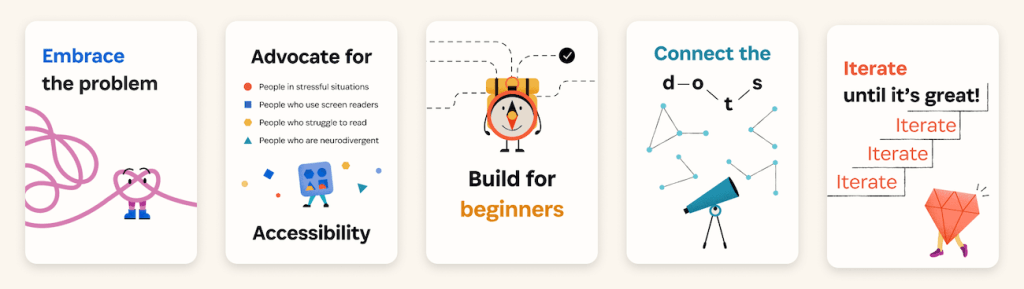
Embrace the problem
Advocate for accessibility
Build for beginners
Connect the dots
Iterate until it’s great
One sort of happy accident with the principles we landed on is that they have a really intuitive order that reflects the design practice, where you start with the problem and end with refining the solution.
The new principles
Embrace the problem
We clearly identify the user problem that needs to be solved and keep it close to our hearts, along with clear criteria to know when we’ve solved it. We seek evidence and validate assumptions about the problem, including how widespread it is.
Advocate for accessibility
Every day we learn a little bit more about accessibility and apply that knowledge to our product work, aiming for progress over perfection. We take ownership of accessibility research and Figma annotation, and we work with developers to make sure people with disabilities can use 1Password.
Build for beginners
We make it easy for people new to 1Password to reach their goals, which also improves the experience for power users. Through research and personas, we focus on the expectations, core needs, and goals of newbies to create a better product for everyone.
Connect the dots
From onboarding to error messages and from desktop to mobile, we make sure users have a seamless experience. We understand how each new feature, large or small, fits into the overall product ecosystem. We also use, refer and contribute to Knox guidance and components, to ensure design details are coherent.
Iterate until it’s great
We explore multiple possible solutions and evaluate them together with cross-functional partners. We keep quality front and centre when negotiating trade-offs or constraints. And we think beyond the MVP by helping the team define and plan for future improvements.
Impact
The new principles launched a few months after I left, so I can’t speak to detailed results. But the people who were involved in their creation were proud of them, and feedback from several designers outside the process and cross-functional leaders, including the Chief Experience Officer and the Chief Product Officer was very positive. As well, Product Ops was excited to find ways to integrate them into the company’s product development processes and documentation.
What I’m proud of
I’m very proud of the collaborative, bottom-up approach I took, and how open I stayed to other people’s inputs. More than once I had a strong opinion that I held only loosely. I’m also proud of the quality of the principles we landed on. They’re short, memorable, concrete and enforceable.
When I started the process, I thought we’d need to revisit the principles in about a year to level them up as our design practice matures. But with where we landed, I’m confident they probably won’t need to be revisited for a few years.
 Kate Wilhelm