
The problem we needed to solve
Shortly after launching COVID Alert and onboarding multiple provinces, we realized we had a problem. When a person’s app went into the exposed state, the app stopped checking for exposures until the exposed state passed after 14 days. The app kept exchanging random codes with other people’s nearby apps, but it just didn’t check the server for exposures. That meant users could have subsequent exposures without being notified – which went against the whole point of the app.
Our developers were still learning the very complex code base, and it would be very time-consuming and risky to make the app continue checking for exposures during an exposed state. So we needed to encourage users to reset their exposure status.
- How might we convey the appropriate visual hierarchy with two important, sequential actions when we don’t have a clear trigger or data to govern the second action?
- How might we get users to reset their exposure status?
- How might we convey multiple exposures within 14 days?
Team structure and project details
Employer: Canadian Digital Service, Government of Canada
Partner: Health Canada
Duration: about 2 months
My deliverables: Content-first design, user flows, UX writing, design strategy, facilitated collaborative workshops
Team structure: Product Manager, Design Researcher, Interaction Designer, French Content Designer, 3-4 Developers.
Collaborated on: User research planning, observing, synthesis, high-fidelity mock-ups, interaction design, and visual design
My role: Lead Designer and Content Designer
First iteration
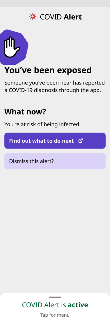
Our first iteration seemed simple: I used the language we were already using internally on two visually primary buttons. I made minor updates to shorten the first paragraph and also to make it accurate with multiple exposures. I also removed the time frame from the main heading for similar accuracy reasons.
We also added a new option to the app menu with a permanent link to the province’s healthcare advice.


More explorations
In our first round of user research we learned that the word “reset” caused a lot of misunderstandings and stress for users. It made the button seem scary, and participants thought it would reset all their app’s data.
Participants didn’t understand why they would want to reset their exposure status, and they were unlikely to tap the button, which was an utter failure.
We explored different language on the button, and different hierarchy and context to encourage users to tap the button.
The interaction designer suggested a light violet colour for a secondary button design, but I didn’t love the lack of contrast with the grey background. I tried giving all the information but it was just so much text, plus when the app has one real job, it didn’t feel right to expose this problem.
We tried adding the information to a modal the user would see after tapping Dismiss this alert? but I worried they just wouldn’t tap the button.


Second round of usability testing
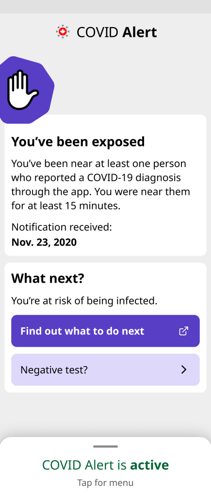
After many, many explorations, we eventually landed on separating the buttons with information that would help convey the idea that they would tap the first “What to do” button and later, whenever they were ready, they could dismiss the alert. We added the date of notification to help tie the idea of dismissing to the specific date(s) involved.

From this research, we learned that participants:
- Didn’t understand why they would dismiss the alert.
- Worried that if other people dismissed it, that meant they were not taking any action to protect people.
- Reported bringing this exposed screen to testing centres as proof, even though they weren’t required to.
- Felt that people should only dismiss the alert after getting a negative test result.
- Were really glad to see the date, as they often wonder if the exposure is new or if it’s the same as the first one. But they also wanted to hold onto the date, so the date was almost a disincentive for dismissing.
To address those findings, we decided to:
- Align with users’ mental models and connect dismissing to negative tests.
- Move the date of notification higher up, so it’s not attached to what’s being dismissed.
- Add information about what an exposure is back in, but reflecting the cumulative approach the app now takes.
- Add reassurance that dismissing doesn’t affect their exposure logs.
We went through several more iterations with internal design reviews and stakeholder meetings, finally landing on an approach that was fairly simple, had appropriate visual hierarchy, and allowed people to update the app to match their latest health status.
Final design: reflecting people’s health status
By the time we finished two rounds of research and multiple explorations, developers had also learned the code base well enough to find out that it wasn’t very time consuming after all to make the app keep checking for exposures even in an exposed state.
So that helped us narrow the objective of this design to primarily allowing people to update the app with their latest health status, while addressing the root cause problem through code, instead of getting users to do something they weren’t otherwise inclined to do.
That also gave us more comfort to move the reassurance about dismissing behind the secondary button, as dismissing was more optional now. And finally the interaction designer came up with this card design, which improved the contrast with the secondary button colour and helped convey the sequence of information.

Impact and learnings
Because of COVID Alert’s privacy protecting commitment, we didn’t track how many people dismissed their alert from an exposed state. But we at least knew we were addressing the feedback we’d heard from users who specifically asked for a way to change their status after receiving an exposure notification.
If I had to do it again, I would have pushed back a bit harder at the start to get the actual facts about the effort required to update the code to keep checking for exposures in an exposed state.
