
Tool to help people find financial help during COVID-19
This was a short (2 to 3 months) project to create and launch an interactive tool to help people find financial help during COVID-19.
The problem we needed to solve
The country was in crisis, with almost all businesses suddenly shut down to slow the spread of COVID-19. People whose livelihoods were suddenly gone needed to find help to pay their bills.
The government had created a new program to help with income for people who had lost work, but eligibility criteria were hard to find and understand. And we discovered through research that people in many other situations were looking for financial help.
Our task was to find the simplest way, with 1-2 days of work for the first iteration, to help people find out what government programs could help them, and then make the service better.
We soft launched the interactive tool after a few weeks of prototyping and usability testing, and then the Prime Minister announced it a few weeks after that.
Our approach
We took a content-first, mobile-first approach. We started with static page content with descriptions of different situations that I wrote from analyzing eligibility criteria of relevant government programs. Even though the content was as simple as possible and geared to people’s situations, we knew a more interactive tool would help reduce cognitive load for people in crisis, a situation known to reduce people’s cognitive abilities.
Team structure and project details
Employer: Canadian Digital Service, Government of Canada
Partner: Employment and Social Development Canada and Service Canada (ESDC)
Duration: 2 months
Team structure: Product Manager, Design Researcher, Interaction Designer, Policy Advisor, 3-4 Developers
My deliverables: Content-first design, user flows, eligibility analysis, information architecture, results logic, UX writing
Collaborated on: User research planning, observing, synthesis, high-fidelity mock-ups, interaction design
Stakeholders: Took a long time to identify (probably the biggest challenge of the project) and eventually landed with a few ESDC executives
My role
I researched and analyzed eligibility requirements of new federal programs, and defined the question and results logic for the tool. I wrote all the words on all the screen, and collaborated with an interaction designer on the visual design and interaction.
I also worked with developers, researchers, the product manager and many stakeholders to move from mock-ups to a live tool. I was one of several researchers and designers who monitored feedback and iterated on designs to address problems we identified from the feedback. I also defined and published content design principles and voice and tone guidance, including researching and coding an accessible table for the voice and tone guidance.
Information architecture
First I worked closely with our policy advisor to research and analyze all the eligibility requirements of programs that might be able to help people financially. From that analysis, I wrote the static page content first, and later I defined and maintained the question and result logic.
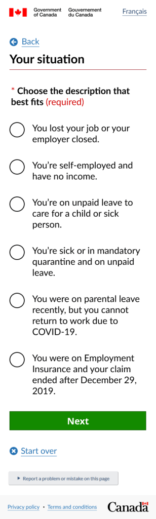
I stuck to a structure of one question per page based on UK Government Digital Service standards. I started with the questions that would have the biggest impact to segment people based on the program eligibility criteria and went on to questions that informed results but didn’t change their path through the questions.
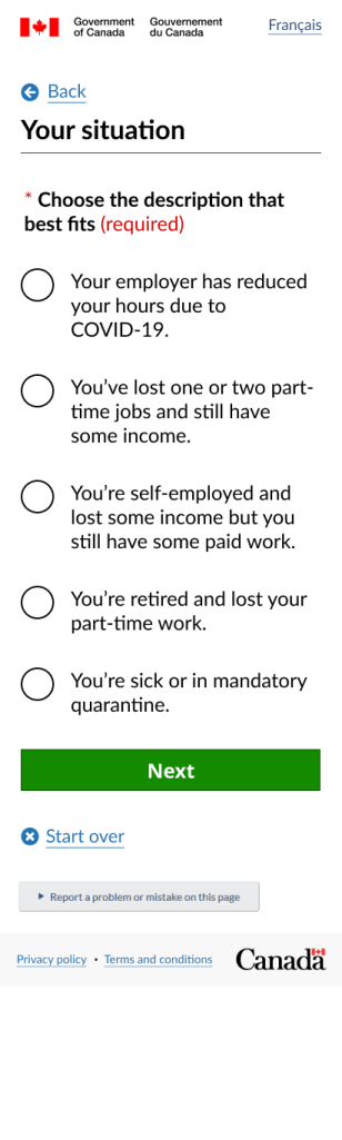
For example, the first question was did you stop working because of COVID-19. The next question asked them to choose the description that best matched their situation. The descriptions were grouped based on their answer to the previous question, and we learned through the research that this question could be a blocker if there was no description that matched their situation. In later iterations we added a “None of the above” option so they could at least get through to results.
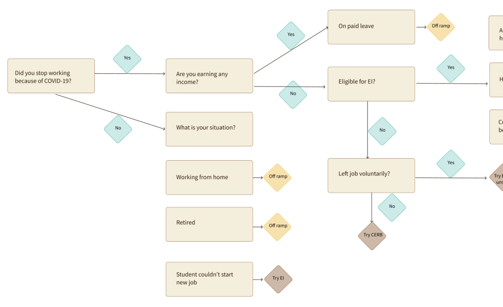
I also identified the need for easy governance of the question and result logic in the tool, because we knew new programs would be added and eligibility criteria would be clarified. I even researched possible tools to make maintaining the question and result logic easier and less prone to human error. I didn’t find a good tool, but my favourite attempt was Twine, software made for authors writing “choose your own adventure” stories.
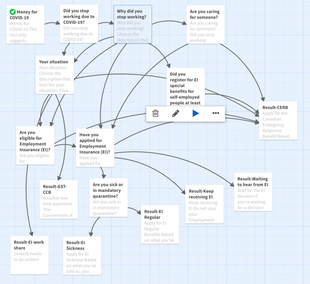
In the end, we just used a figma plugin to show the flows alongside each screen design and relied on developers to make separate updates to the code. If I could do it over, I would urge the team to view the first code as a prototype and plan to build new code that would allow non-developers to update the question and answer flow.
I also defined the structure of information for each program result card, and other content design principles and voice and tone guidance.
For each result, we included:
- How much money they could get or save.
- When they can expect to receive it.
- How frequently they’ll receive money if it’s more than once.
- What they need to do to get it.
- Information to help them decide whether to take the next step of investigating or if they should rule themselves out.
User research findings
We conducted multiple rounds of moderated usability testing combined with interviews with an html prototype, which was fully accessible for screen readers, keyboard navigation, and mobile devices, unlike some other kinds of clickable prototypes.
We learned from this testing that people understood the questions and answers well, but people’s situations were way more nuanced than we’d realized. We found several situations where the participant wasn’t able to use the tool because their situation wasn’t represented in it, so we added those in. For example, I had thought retired people would be unaffected financially by the lockdown. But one participant had lost their part-time work as a companion and had increased expenses from delivery fees.
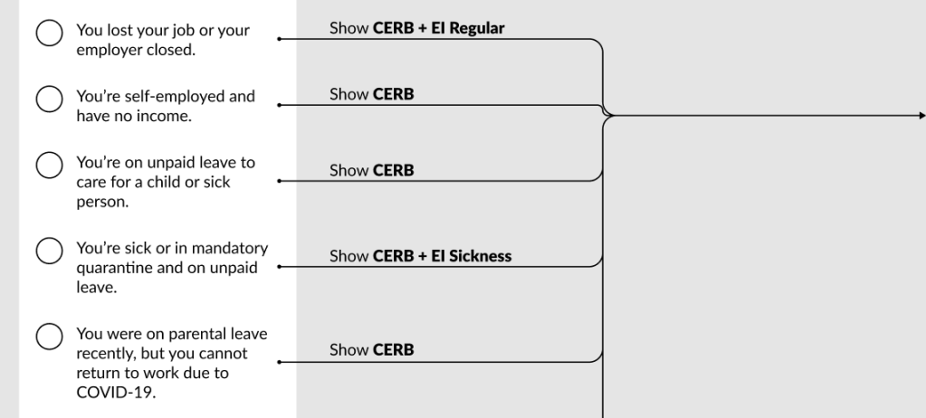
The following screen shots show two variations of situations, one for people who told us they lost part of their income and one for people who had lost all their income.
What I’m most proud of
I’m most proud of my work on the question and results logic. So often content design work is seen as putting words in boxes that other people create, but my best work comes much earlier in the process. While I haven’t been shy in the past about diving into content logic and working closely with developers, this work I did largely independently of developers.
You, me and we
I’m also proud of the care I took in writing the questions and answer options. One of my biggest pet peeves is when interfaces switch who “you,” “me” and “we” are. It’s almost become a convention in a lot of question and answer formats, but it creates confusion and unclarity. For this tool, I made sure that “we” always referred to the government and we only used “you” to refer to the user.
As well, I only used actual questions very sparingly, since questions mostly require the person to read every single word right to the end before they can pick up the meaning. Often, clear instructions can be easier to scan and respond to. In this tool, I used a mix of questions and instructions depending on the context of each question.


The smallest dot on the screen
We also found through our accessibility testing, that our first iteration of content did not offer a great experience for people who use immersive screen readers. Immersive screen readers do not read the actual code, unlike other screen readers. They’re typically used by people with learning disability or neurodivergence, and they only read the text displayed on the screen.
Our first draft had no punctuation at the end of each option, but the immersive screen reader did not recognize the end of the line, and read the next line without any pause. When we added a period to the end of the line, the screen reader made a slight pause. One user of immersive screen readers, when they heard the difference with the period, responded with relief that they hadn’t known it was possible to have any other experience than the previously difficult experience.
Putting periods at the end of list items, especially when they’re short, is pretty unconventional among writers. We did get considerable pushback from writers outside my organization for our approach, but I will always choose decisions that make experiences better for people over what looks nicer or what we’re used to seeing. The readability guidelines from the UK also support the need for punctuation at the end of list items for the same reason. My preference is for periods because they’re the simplest. Semi-colons are too elevated, and commas don’t always work. I believe mixing commas and periods would distract from the information.
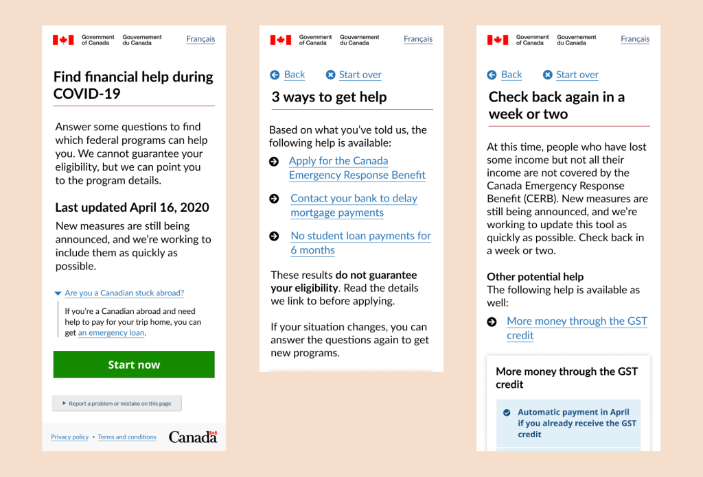
Impact: Helped nearly 400,000 people
During the first 6 weeks after the Prime Minister’s announcement, more than 600,000 people used the tool.
Of those, 63% (nearly 400,000 people) got to results.
31% (nearly 200,000) clicked on a result to learn more about the programs they might be eligible for, which seems an incredible conversion rate to me.
But the biggest impact of this work is not in the number of users or the fact that the Prime Minister talked about it. The real impact was in how we helped different federal departments work together to help people in need. And to show that it is possible to make software that is easy to use and understand, quickly and in the open, even in government. You can have both speed and quality!
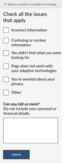
First open-text feedback in Government of Canada
This was also the first time the federal government invited feedback in the form of an open text box, something that was often shied away from because of the potential for people to share personally identifiable information that the department did not have authority to collect.
We based the design on a feedback component I helped design late in 2019, where we gave people check boxes to select as well as an open text box so they could choose how much effort they wanted to put in. There was almost no validation, so if a person only wanted to tick a box or only wanted to give free form feedback, all feedback was welcomed.
We received 1,400 feedback reports in the first month and were able to make many small but important improvements as a result of what we learned from the feedback.
In summer 2024, I discovered the canada.ca Design System now has a feedback component with a free text box, so that’s now been normalized.
What I learned
From this project I learned that sometimes leaping into code really quickly can mean it takes longer to update and maintain that code. I also learned about the phenomenon of stakeholders coming out of the woodwork as you get close to launching.
Because content design doesn’t have any gatekeeping inherent to it like visual design (not everyone can access or use design software) or code, the words on the screen often get the most feedback, suggestions, resistance and required changes before something can go live. In many professional organizations, we are rewarded for using jargon and bureaucratic language, so it can be really scary for people to see clear language being published. Going forward, I will make sure to start with stakeholder mapping and also create a plan that all stakeholders agree to for what happens when new stakeholders emerge.
More example screen shots

 Kate Wilhelm