Canada’s exposure notification app
COVID Alert helped slow the spread of COVID-19 without tracking the identity or location of its users. It got a lot of attention for its content and design when it launched in late July 2020. The app used the Google-Apple Exposure Notifications (GAEN) framework, and shortly after it launched Apple told us that it was the highest rated app in the world that uses the framework. When it was retired, the app had 6.6 million downloads. It won a 2021 ClearMark Award for its clear language and design.
A 2021 study found that COVID Alert saved up to 100 lives and prevented up to 10,000 cases of COVID-19.
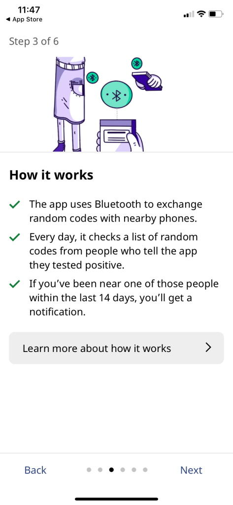
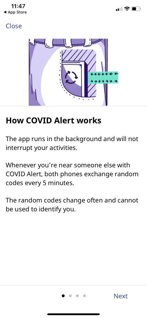
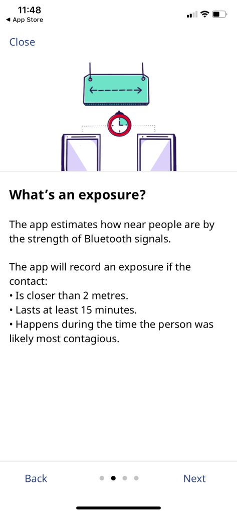
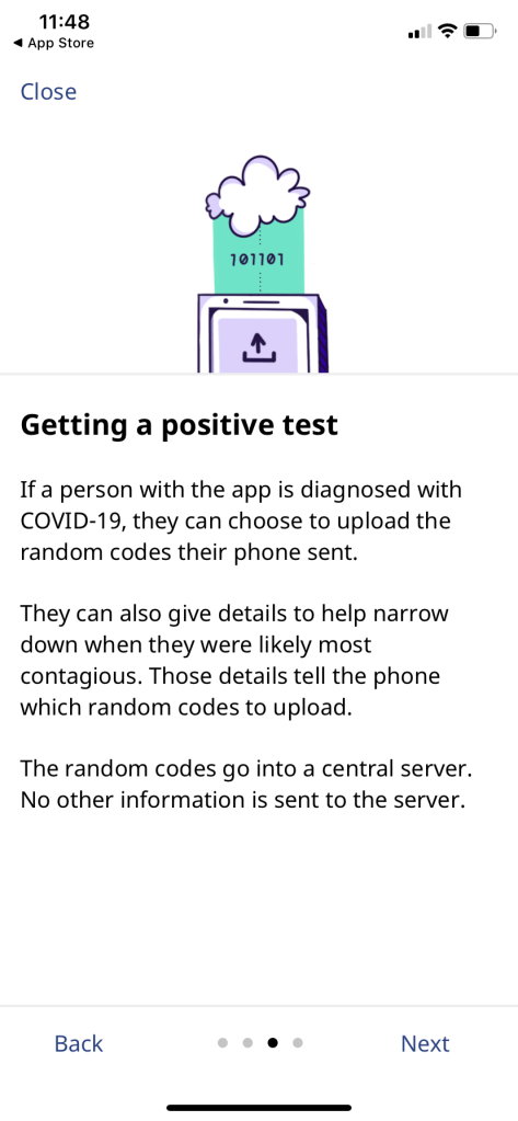
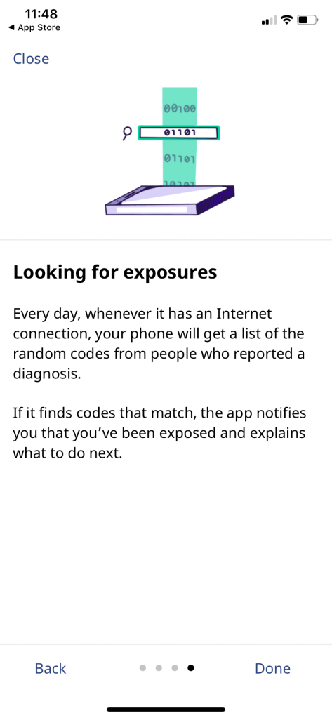
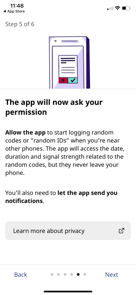
COVID Alert used Bluetooth to send and receive random codes with nearby apps. If someone you were near reports a COVID-19 diagnosis through the app, and you were less than 2 metres from that person for more than 15 minutes, you would get a notification that you’ve been exposed.

The problem we needed to solve
Initially, we were given 9 working days to basically rebrand a version of the app that Shopify volunteers had created to work with the Google-Apple Exposure Notifications (GAEN) framework. However, as we learned the codebase, we discovered much more work was required. The app didn’t fully work end to end yet, and the Android version wasn’t fully coded. As well, we needed to ensure the design would build trust with users at every opportunity, because the success of the app depended on uptake, and uptake depended on trust. So we largely redesigned the app as well.
We also needed to ensure it would work across Canada, where 13 provinces and territories have responsibility for healthcare, and some provinces further spread that responsibility to local public health units. For example, Ontario has 34 public health units doing case management and contact tracing.
Team structure and project details
Employer: Canadian Digital Service, Government of Canada
Partner: Health Canada, Office of the Privacy Commissioner
Duration: ~ 6 weeks to launch, then kept improving COVID Alert for a year
My role: Lead Designer
Team structure: Product Manager, Design Researcher, Interaction Designer, French Content Designer, 3-4 Developers. Outside of our product team, there was a server team, a product team to create the supporting healthcare service, and a stakeholder relations team.
My deliverables: Content-first design, user flows, UX writing, design strategy, facilitated collaborative workshops
Collaborated on: User research planning, observing, and synthesis, high-fidelity mock-ups, interaction design, visual design, and illustrations
This work was a tremendous effort involving 4 teams of people: an enablement team who did all the stakeholder relations work to get us the space and time to do good work, an app team, a server team and a healthcare team that built the portal for generating one-time keys when people test positive for COVID-19. I was on the app team.
Working on this team was some of the best collaboration I’ve ever experienced, where all the edges of our roles got a little fuzzy, and yet everyone had their core specialty respected.
My role – lead designer and content designer
- Lead designer (unofficially before launch then officially after launch)
- English content designer
- Backfilled for product manager’s short vacations
- Stakeholder relations for customizing content with provinces and territories
I worked on the app from the beginning, including designing and releasing new features after its launch. As the English content designer, I was also the most senior designer on the app team, and the unofficial lead designer before launch. After launch, I was officially named lead designer, until I stepped down from that responsibility after about six months because I was also a people manager of 5 content designers in addition to creating all the English content, and after a year of the pandemic, I was getting dangerously close to burnout.
I led the content design for the app and worked closely with other designers on the visual and interaction design, including the app logo. I also led a team naming exercise to recommend app names that could work in both English and French. I also collaborated with policy advisors on the app’s privacy notice and other documentation.
At first, we had 2 interaction designers and 3 content designers working on the app. We were eventually able to reduce that to 1 interaction designer and 2 content designers (one English and one French).
My approach
My first task was to figure out the right structure and design for onboarding. Meanwhile, researchers combed through previous user research from other jurisdictions, including Ontario, which had also forked a version of the Shopify app. Then we worked our way through designing the rest of the app, including the notifications and flows for reporting a diagnosis to the app.
Ontario had already agreed to be the first province to support the app, so I also worked closely with people from the Ontario government to ensure the notification would work in their context.
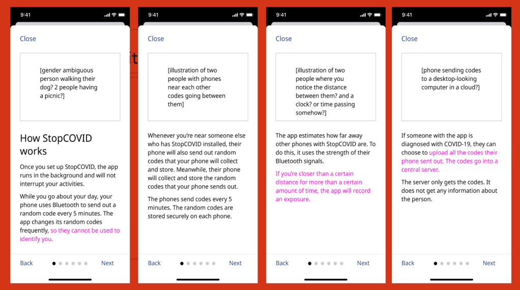
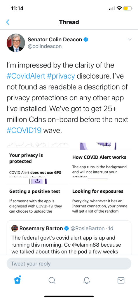
Inspired by a comic about privacy-first contact tracing I’d seen weeks or months before I had any idea I’d be working on an app like that, I knew right away we needed illustrations to help explain the complexity and privacy protection.
First I worked with another content designer and the product manager to nail the words. I did the first draft of our onboarding and an optional “How it works” section, another content designer reviewed with a view to cutting unnecessary words, then the product manager further helped refine and economize the language to really get at the heart of what needed to be conveyed. Other designers and researchers also regularly gave critique.
I worked with the interaction designer to ensure each screen had the right visual hierarchy, and with the illustrator to ensure the illustrations conveyed the concepts clearly.
Early iterations
A (very technically inclined) friend has already found it in the App Store and texted me the following: “I meant to tell you, very good job with the app. The intro and setup was easy, but most importantly explained things in simple language, yet answered all my advanced questions.”
Private message from a colleague
Key findings from user research
We conducted multiple rounds of semi-structured interviews and usability testing. We tested multiple iterations of the onboarding and “How it works” screens to ensure they were clear and understandable, and answered people’s questions in the right priority. We made several iterations in response to findings.
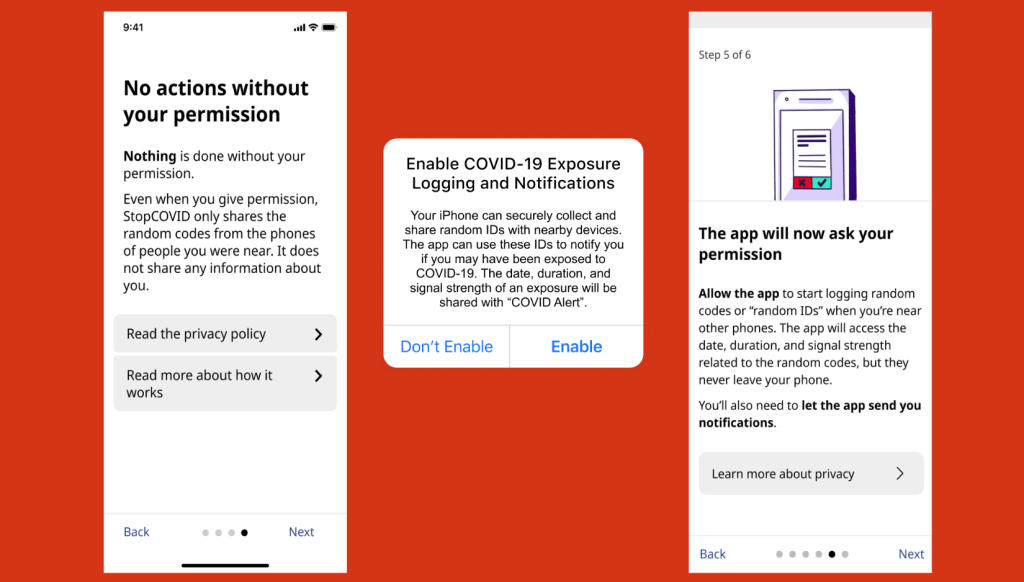
In the initial round, several participants said they would stop the onboarding process and delete the app because of inconsistent wording between the app and messages from the phone’s operating system, which we couldn’t change. So we needed to bridge people from the app’s terms to the operating system terms.
Other participants articulated what questions they still had, based off of the onboarding content. We used their questions to inform and prioritize what else might need to be addressed, and at what points in the onboarding process. We also did comprehension testing on the illustrations, and made some crucial adjustments to ensure they created accurate impressions.
We also learned from testing that needed to stop using “it” to refer to the app quite frequently even though it was so much shorter than “COVID Alert.” In testing, people often lost track of what “it” was referring to. So we had to make sure the antecedents of “it” or other pronouns were always completely unambiguous. We used “it” a lot less frequently as a result. This was another example where brevity can get in the way of clarity. For more examples like this, check out my blog post, “Just enough detail.”
We also ran two quantitative studies before launch: one small scale with 100 to 200 friends and families of the people working on the app, as well as a larger-scale study with thousands of participants. That gave us confidence to launch widely, and had the added benefit of a group of well-informed people to address any misinformation on social media.
What I’m most proud of
I’m proud of the collaboration I helped facilitate. I’ve heard from other designers that my feedback not only helped the piece they were working on, but also gave them a new perspective on feedback, and a new model for critique. It’s been really exciting to see people step into more of their power, partly because of space I helped create. I built great relationships with research, developers and product, which I continue to enjoy.
Content design FTW!
In addition to such wonderful collaboration, I’m most proud of the quality of content and design we were able to launch with. As I said on launch day:
I’ve never before been so proud of something I’ve worked on. So many times in the past I’ve felt like I had to compromise on important design and content decisions, and I do not feel that at all today.
Me on launch day
And of course, I’m not gonna lie, it’s gratifying to work on something that my friends and family used. It was really exciting to see a lot of people — strangers — notice the care we put into the words and design, care I’ve put into my work for my whole career.
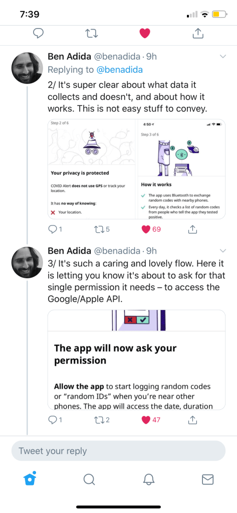
It’s such a caring and lovely flow.
Twitter user @benadida from screen shot below
Speaking of trust and transparency
I’m also proud that I successfully advocated to add advice to the app’s privacy notice about Google’s requirement that Android phones needed to have location services on to run the app’s Bluetooth. If we weren’t transparent about this, it could have undermined trust in the app. Plus we were potentially exposing users’ data. This is what we put in the privacy notice:
To use Bluetooth scanning, Android phones using Android 6, 7, 8, 9 or 10 need the “Location” setting turned on for all apps.
While COVID Alert has no way of knowing where you are, Google may have access to your location.
If you have an Android phone using Android 6, 7, 8, 9 or 10, you may want to use the lowest accuracy option for
“Location” and turn off “Google Location History.”
Android 11 doesn’t need the “Location” setting to be turned on to use COVID Alert.
You can check the app’s permissions in your phone’s settings. COVID Alert doesn’t have permission to use location services.
In the next Android operating system update, Google removed the requirement to have location services on.
Impact
We estimate about 23.4 million people in Canada have a smart phone that could use the app and are in a province that supports the service. With 6.6 million downloads at this time, that represents about 27.8% of potential users. This UK study estimated that for every 1% increase in app users, the number of infections can be reduced by 0.8% (from modelling) or 2.3% (from statistical analysis). An independent study found that COVID Alert saved up to 100 lives and prevented up to 10,000 cases of COVID-19.
While that’s not as high as we’d like to see, several anecdotal stories have come from social media. One teacher shared on social media that they had gotten an exposure notification and ended up testing positive even though they had no symptoms. They successfully stopped the chain of transmission by staying away from their classroom. Other stories have emerged of people getting an exposure notification and changing their behaviour until they tested negative.
What I learned
I think my favourite learning from COVID Alert is how running a large-scale beta test before launch created an army of people who were keen and well-informed about the app. We thought we were just testing functionality, but it turned out to be a brilliant communication tactic. Again and again, when misinformation showed up on social media or even in traditional media, beta testers were piping up with the correct information. I’m sure our media relations people deeply appreciated it!
It’s a great example of how involving people in making a thing creates advocates, and that’s a principle I will carry forward into all my work.
I’m still processing my learning on what conditions are needed to release great content. But this is one of those projects that will forever stay with me as primarily a celebration of what’s possible when a bunch of great people work together.
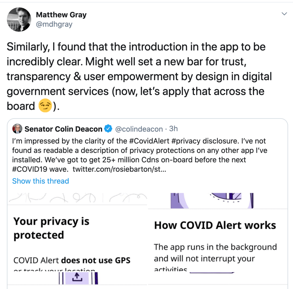
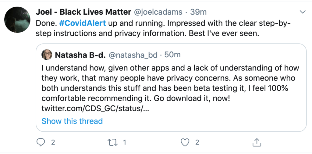
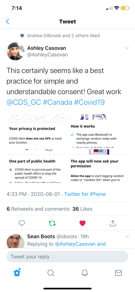
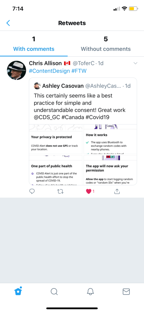
More screen shots